01 / Attention
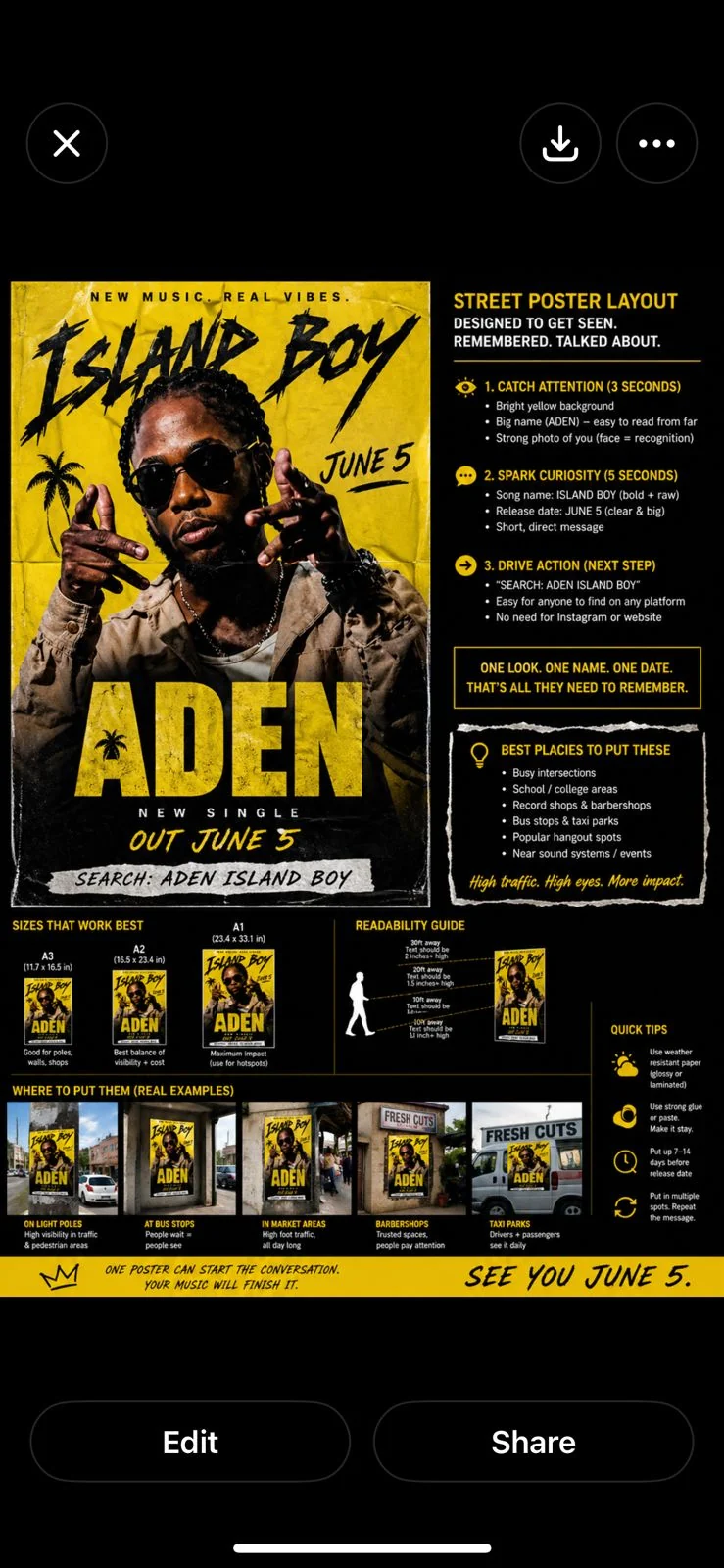
Big color, big name, direct face.
The yellow poster reads quickly from distance and makes Saint Chris recognizable before the viewer has time to overthink it.
Campaign / Posters / Rollout
The Island Boy street campaign gets its own route now: poster assets, placement logic, sizing standards, and campaign deck entry points.
Street campaign
The poster system stays blunt on purpose: face, title, release date, and search phrase. It is built for bus stops, barber shops, campuses, corners, and screenshots.
Request campaign deck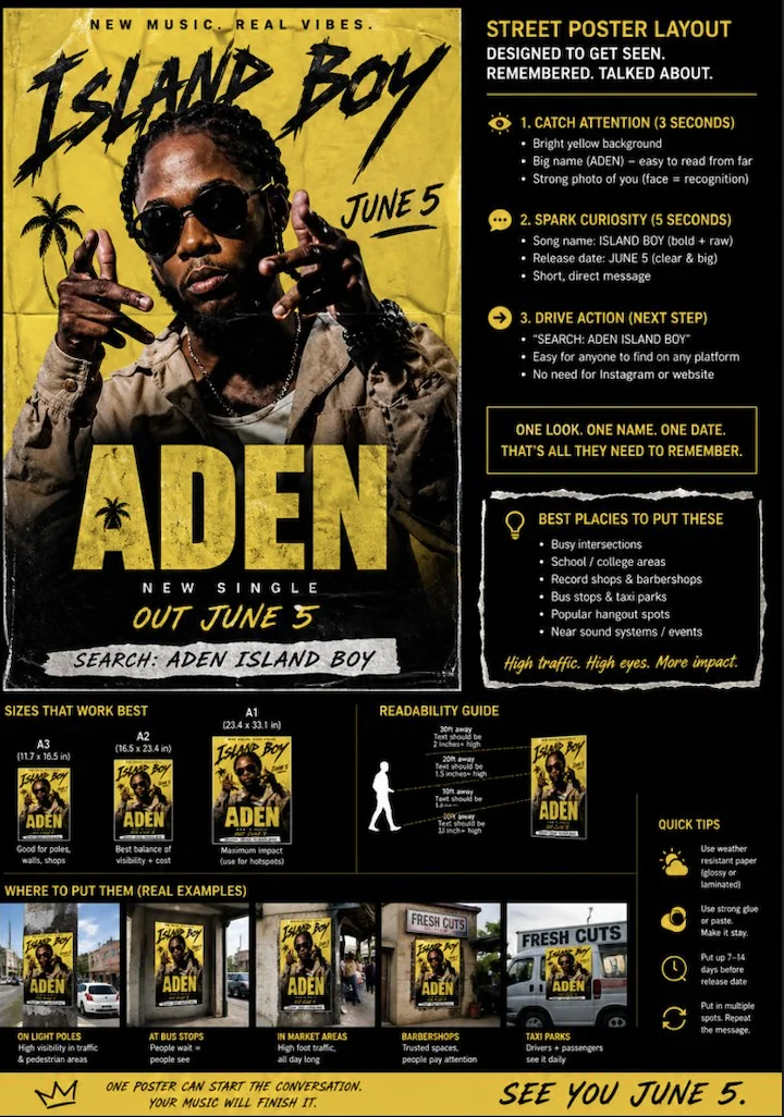
Rollout standards
The campaign page separates strategy from portfolio. This is where the poster system explains itself: traffic, scale, readability, repetition, and a simple search action.
The yellow poster reads quickly from distance and makes Saint Chris recognizable before the viewer has time to overthink it.
The poster avoids extra links and heavy copy. The audience only needs to remember the name, song, and release timing.
The physical asset drives a simple behavior: search Saint Chris Island Boy on whatever platform the person already uses.
Deck request
This page makes the street poster logic visible without burying it in the image archive. It is built for collaborators who need to understand the campaign, not just look at the artwork.